Louise Sloper & the storytelling superpower of typography.
Louise Sloper, GENIE talent member, Creative Director/Founder of Here.We.Go. Studio, and Chairwoman of The TypoCircle, says that the power of a message is not just in what we say, but the font in which we say it.
“I’m a self-confessed type nerd. I’ve a million books on typography, a distinction at MA level, and my grandfather was a typesetter for the Fleet Street Press.”
I’m also honoured to be the first female Chair of creative organisation, The TypoCircle, for many decades. At college I drew letterform after letterform by hand, measuring carefully with a pica rule, learning the trade. I love the power of the craft to reinforce a message or, in some cases, manipulate it.
Typography is an art form and a science.
With an abundance of typefaces available, and the ability to create new ones with relative ease, there’s more choice than ever. However, this has also had a detrimental effect on the standards of typography. Too often it’s not taught comprehensively at art school, and the industry has lost many of its more senior craftspeople. Despite the importance of typography in visual and tonal messaging, it has often been side-lined, becoming an after-thought behind the photography, for instance, or a casualty of budget-led neglect. But this is such an oversight. Regardless of platform, typographic application has great power in the way we see an idea.
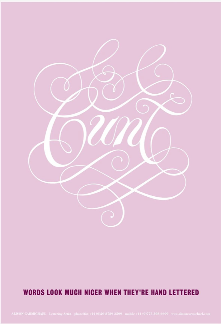
Above: Alison Carmichael’s C*nt postcard, designed by Mark Denton, from 2005.
Since Gutenberg’s printing press, type has evolved from ‘for the few’ to ‘for the masses’. Because of this, we can take typography for granted. How often do we question the choice of font we use to send an email, for instance?
It’s not all bad news for the future of the craft, though. There’s a definite shift in the air to embrace hands-on skills and a realisation that those finer details can have subtle but significant effects on a viewer’s perception of a message. Automated talent agent GENIE is a leading example of this. They look for the best in their creative fields and list typography as a ‘superpower’ as part of their product experience. Championing great typographers on their platform, whilst being a forward-thinking digital product themselves, will only help to connect more type experts with clients and agencies in the future.
Typography can support an image or be the image. It can be quiet and respectful or bold and obnoxious. It can change a word’s meaning altogether. Imagine the word ‘soft’. You might automatically think of rounded edges and plump, squishy or fluffy forms. Maybe it’s in a light, pastel colour. Now imagine the same word with hard corners, squared-off, in deep black, and spikey-looking. Your understanding instantly changes.
It’s an area that fascinates me. ‘Typographic truthiness’ is an area that renowned American graphic designer Herb Lubalin was also intrigued by. He regularly played with setting words to alter meanings in his work. Lettering artist, Alison Carmichael did something similar with her C*nt postcard many years ago. I used the same technique in an Audi ad; hard mechanical words, set in a soft, fluid type style.
Back in 2013, acclaimed filmmaker Errol Morris ran an experiment in the New York Times. Readers were encouraged to consider a passage from The Beginning of Infinity by David Deutsch, discussing the likelihood of Earth being destroyed by an asteroid. The catch was that the online article was secretly set in varied, randomised typefaces, and followed by a survey asking whether the viewer agreed with Deutsch’s statement and, consequently, if they saw themselves as an optimist or a pessimist.
What Morris discovered was that Baskerville was statistically more likely to influence the minds of the participants than Georgia, Helvetica, Comic Sans or Trebuchet. It was a small but interesting experiment illustrating how typography can shape our perception of the truth.
The storytelling superpower of typography impacts our decisions every single day. An ad campaign that influenced my decision to become a designer was for Haagen Dazs back in the 90s. The typography was plain sexy. It sold more ice-cream. Politicians are aware of typography’s impact; the Nazi’s re- association with Blackletter as a shorthand to Germanic culture was a prime example. So are newspaper mastheads, with inherent bias towards left or right wing thinking being applied subconsciously to a specific typeface.
Digital platforms have not always been the most exciting areas for typographic innovation, or indeed craft, due to choice and technical restrictions, but things are changing.
Variable type – flexible typesetting or fluid typography – is being adopted by major platforms, with ever increasing offerings. One font file that behaves like multiple files, combining weights and styles in to the CSS to bring down file sizes and maximise choice. The Polite Type is a typeface with built-in AI, has lead the way in changing societal thinking. The next stage will be imaging fonts that work purely in the 3D space, challenging traditional methods of type design and usage.
So, next time you write that email, have a think about how you want your words to be read. Typography is more powerful than you might think.
This article was originally published in Shots on 2nd November 2021.